Project 4

Twitter.jpg

I had a lot of fun with this last project!  It was a challenge selling a phone like Nokia but that was sort of the fun in it – thinking outside the box in that aspect.  Lauren and I decided to stress the “classic” aspect of Nokia.  I photoshopped Nokia phones into classic paintings to emphasize that the phone is so classic that it is comparable to say, the Mona Lisa.  The video used the same images and looked as if they were in a museum, and the curator was the narrator.  I definitely would like to make the phones stand out more in the pictures because I think it would be easier to understand.  I think it was pretty funny, and I know I would stop to check out these tweets if they were actually on Twitter.

Project 3 – Lip Shit

couponStyle_Tile_Template

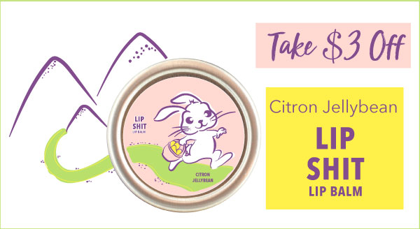
I have included the coupon and style tile above.   Overall, I had a lot of fun doing this project.  Since I worked on this project over Easter break, I thought it was fitting to theme it off of the holiday.  I actually visited a small boutique in Corning and fell in love with this brand – BlueQ.  They have a great mission and their products are very funny.  So, I decided to follow the style of “Lip Shit” and simply add a new flavor – Citron JellyBean.  The colors for Lip Shit are often simple, so I went with pastel Spring colors.  If you look up current Lip Shit flavors, the digital illustration on my flavor matches that look.  I am pretty proud of the illustration, it was tedious and took several versions to come up with the final one.  I utilized the pencil tool techniques that you went over in class to get that “sketched look.”  For the color fill, I used the brush tool to make it look scribbled and rough.  This has definitely been my favorite project so far!  I like working alone and feel that I have better ideas that way.

Project 2 – Ad Design

This slideshow requires JavaScript.

Overall, I enjoyed this project more than the last one.  The brands were real and easier to work with.  Above are my initial designs.  Our flavor was “tzaztiki” and we wanted the Greek theme to be reflected in the design.  That’s why I went with the simple off white and blue color scheme.  We wanted the ads to tell a story, by animating the chip himself.  I worked very hard on this project as the illustration elements were very tedious.  I was discouraged in the critique.  I would have like some more suggestions as to how to improve this theme.  However, I’ll probably just have to start over.  Stay tuned for an updated version.

Project 1 – Ad Design

I had a lot of fun creating the logo for this project.  I think of all the components of this project, that is what I am most proud of.  I feel that I actually created a portfolio piece.  I was not a big fan of the collaborative aspect for this.  If we are given a partner/ group assignment we need at least two weeks for it.  It was difficult because my partner was only present one class period, so I was on my own for most of it.  I like the idea of using children because I think it really tugs on the heart string for viewers.  I definitely could have improved the quality of the “free” type that the little girl is holding.  As I mentioned previously, if we had more time, I could have put much more time and effort into the design quality.  I’d like to find better quality images of children holding blank signs; I just used those photos as placeholders to portray the idea.  I am not super happy with what I produced; however, conceptually I think this idea could be really awesome.  I also came up with the verbiage (which wasn’t my job anyhow).  I think that with more thought that part could be a lot stronger.  Overall I think that with improvement, the final product of this idea could be really strong.

Project 5 – data tables

Lindsey_Bender_Project_5.jpg

This last project was a great wrap up of the things we learned this year. It incorporated the use of font families, hierarchy, alignment, baseline shift and paragraph styles. I actually used paragraph alignment for this project. Now that I understand how to use it, its actually pretty easy! I can’t believe I’ve never used it before! I wanted to use a serif and sans serif font to provide contrast and try to match the Canisius fonts; I used Adobe Garamond Pro as well as Avenir Next. I stuck with a simple Navy Blue for the text color, and for the gray, I simply changed the ‘tint’ of that navy blue color. It was difficult to figure out a cohesive layout to fit everything on one page. I contemplated stretching it to two pages; however, I thought that if this were a real guide, it would be much more reader friendly for students to glance at one page.

Project 4- Hierarchy

Lindsey Bender exercise 4

This project was actually pretty fun! In the beginning, I had the idea to make a template for a blog post, because blogs are more interesting to me than newspaper stories. After feedback from Ben, I decided to tweek my blog post to be more-so a recipe post, for say a recipe blog or website. I played within my favorite font family- Avenir Next. By using different weights, there is a clear definition between the different aspects of this recipe post. I included the date, title, author, subhead, body, image, and even a print icon to make printing easy. I wanted to make a template that is clean and easy to follow, while being visually appealing, or eye-grabbing. I want this template to make people think, “wow this looks easy, I can make this recipe.” I balanced the black and white color scheme by making the black text boxes on the opposite corners of the template. The heavy gray number for the date balances nicely with the print icon in the opposite top-hand corner. The title sits on a light gray rectangle to help separate and define the space. I sandwiched the text in the middle; the plus signs allow the reader to get a preview of the recipe, while not overwhelming them with super small text displaying the entire recipe. This gives them to option to drop down the full recipe or simply scrolling to the next one. A picture is worth a thousand words! That’s why I decided to allow the photo to take up so much room. Overall, I think this is a great generic template for any recipe blog. The space allotted for each aspect of a recipe post allows for any size or length of information to be placed within it (i.e. long or short title, long or short author name etc. ).

Project 3- Alignment

Lindsey_Bender_Project 3_final

I started this project by breaking apart the text about “writing” & “print,” similar to the example in the text. I really liked how it looked on the page with the one section L aligned and the other R aligned. I capitalized and super kerned the words “writing” and “print” so that they would stand out, and that it was clear the two were being compared.  I pulled important statements from the body to make larger and italics.  I used the baseline shift element to help align the body and the featured text.  I unchecked the “hyphen” element to be sure that no words were split line-to-line with a hyphen.  Overall, this was a useful assignment.  Although it may not have been the most exciting, alignment is an element that can make or break a page of work AND is often misused.  It is important to get an accurate understanding of how to organize text on a page.

Project Two

I was not a big fan of this exercise.  The opportunity to apply creativity was very limited. I had to try and get creative with things like kerning and positioning.  I did have fun playing with the movie titles, and thinking about how the placement could allude to what the movie was about.  My thought process was first, looking at the adjectives that Ellen Lupton used in her Word Project.  I got ideas from that as well as the book.  Then, I thought about what movies could be described with those adjectives; and then positioned the letters accordingly.  For Finding Nemo, I thought that “lost” or “journey” would describe the movie.  Hence, the cascading, random letters spelling out “finding.”  The Hunger Games is all about “elimination” and “falling.”  I incorporated that with the fading “n” in the movie title.

Cemetery Typehunting- Typography

7516798736_IMG_1822

The tombstone “Victor Speer” is an example of Transitional Sans Serif.

7516798736_IMG_1824

“Mayes'” tombstone displays a Transitional font.

7516798736_IMG_1826

This headstone labeled “Drewett” is displayed in a Humanist San Serif font.

7516798736_IMG_1827

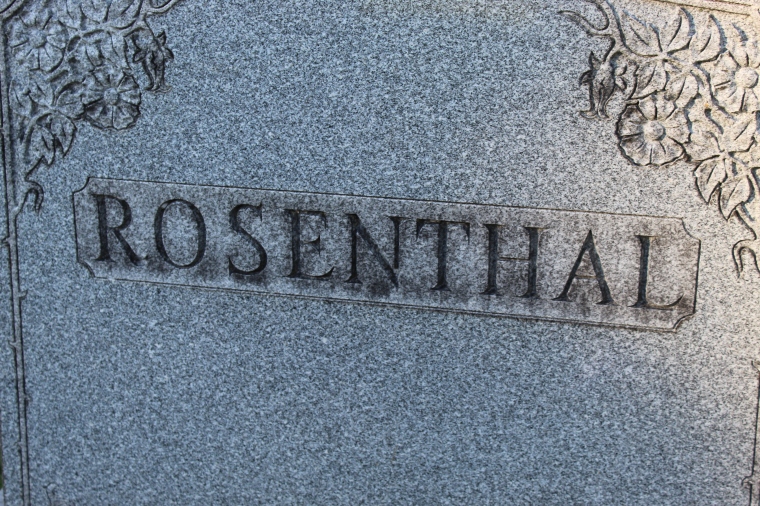
“Rosenthal” portrays a Humanist or Old Style font.

7516798736_IMG_1828

The headstone of “Elsheimer” seems to reflect a geometric font.

7516798736_IMG_1831

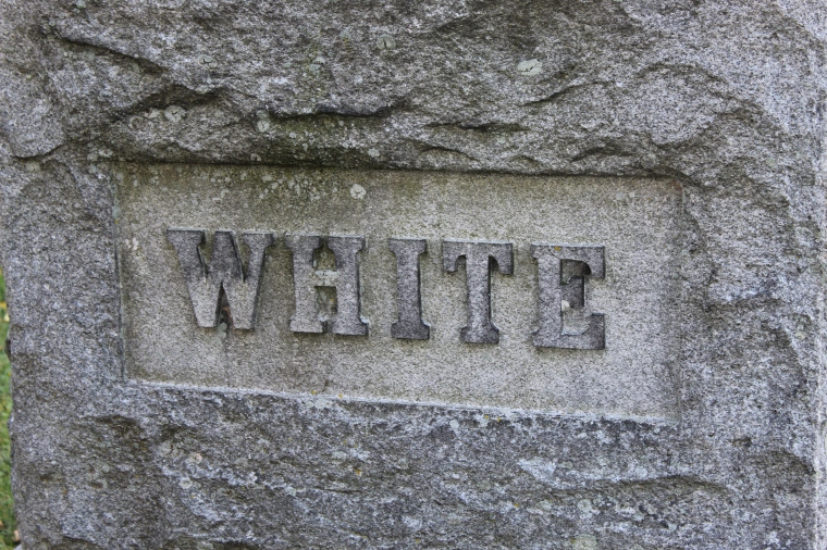
“White’s” headstone is definitely an Egyptian or Slab Serif font.

Exercise 1- Font

Creating our own fonts was a lot tougher than I anticipated it to be!  I enjoyed the challenge, however, I had no idea how complex the anatomy of type really is until not only learning the basics but then designing our own!  I think the most difficult part of this project to me was finding a consistent pattern to apply to a full alphabet.  As you can see on the right with my doodles, I sketched out some cool ideas but none of them were well-designed to create an entire alphabet to match.  At first, I thought about doing a serious, more structured font.  However, I was at work (I work at a Mexican restaurant) one night and I planned on working on my font some more once I got out.  I got to brainstorming about what things could inspire a font.  And then it hit me- Cacti!  With the new “succulent” craze and a little Mexican inspiration, I came to design “Prickly.”  I figured- why not make a playful font, I’m sure everyone else’s will be structured and serious!  To maintain consistency, I used entirely vector shapes to form the letters.  I used the same size long ovals over and over to maintain the correct size and spacing.  The needles are the same vector triangle copy and pasted.  I used the grid lines to space them out.  I definitely struggled more with the numbers and symbols.


Project 4: Movie Poster Edits

Here, I struggled with the editing.  I brought the font down into the window.  I also changed the color of the font to a brighter green as opposed to a brown-green.  I think this is the project that was the most time consuming to me; I am very pleased with how it came out.  A lot of work went into the final product!